An Introduction to Component Composition, by Example
There are many ways to write components for a design system. Depending on who you speak to, only one of them is the right way.
Component composition is a popular way of building components with a more modular and reusable API.
This article is going to take you through a component and look at...
- how we might approach building it
- things to keep in mind
- useful tips for styling and state
- and, benefits of composition.
It will be an in-depth look at a real-world example that can allow you to learn-by-doing.
So, What Exactly is Component Composition?
One way to think about it is that you're building components that subscribe a plug-and-play model, meaning that you can choose when to use different parts of a component, or swap in other components instead. This is possible due to composition. Components are composed togethers, instead of being defined through a series of props.
Composable components are also dumb - they should not have knowledge of things that do not concern them, and should not make assumptions about their use cases. They should be able to be highly reusable.
In the long-term, composable components are much more maintainable, scalable, and adaptable. This is in contrast to prop-based components that might be beneficial in the short-term, but would require lots of modifications and maintenance in the long-term. As React frameworks look to adopt React Server Components, composition also allows you to introduce greater separation between server and client components — this can be beneficial for things like core web vital metrics.
Approaching a New Component
Traditionally, when one starts building a new component, there may not be much thought about the final API that consumers would use. Components are often built to fit a certain use case, and are not designed to be flexible or reusable.
One of the starting points with adopting a composition-based approach is to shift how one thinks about building components. There are ways to ease into this change in mindset, and exercises to help think about how we might want our composable API to look before we start building a component.
Figma
Building components based on Figma designs and specifications often gives you a helping hand in thinking about a composable structure for an API. If one selects the component in Figma and starts to look at its structure and how the designers built it, it can offer a starting point for how it could be composed.
In this article, we are going to look at building the following component. The child components will only be visible if their use case requires it, and the alignment of all the components should be able to change.
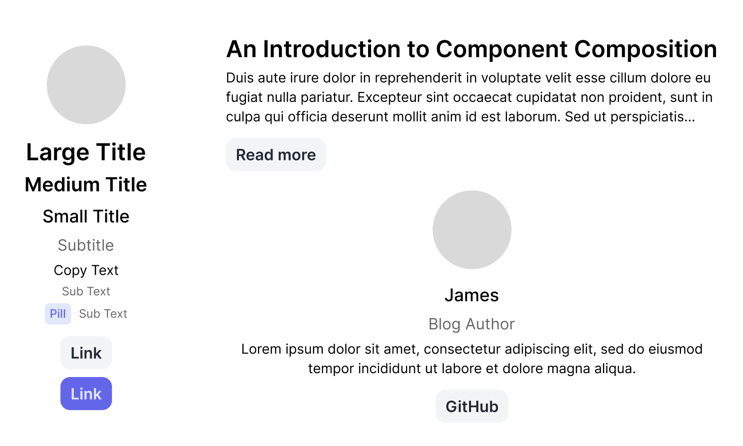 Figma design for an Article Block component.
Now that we understand what our component should look like, let's take a look at the structure that the design has in Figma.
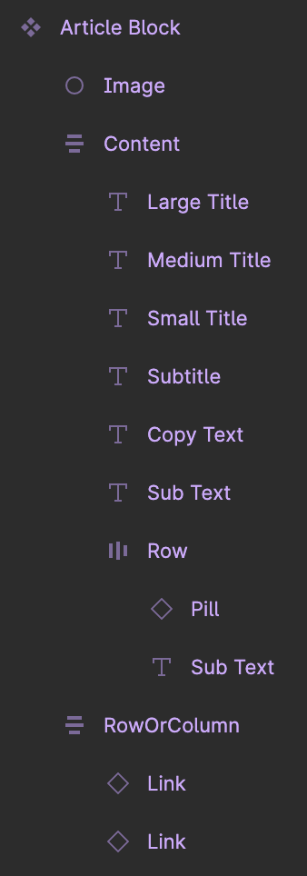 Figma structure for an Article Block component.
In the Figma design, we can see containers that are reflected in the visual appearance, each of which may have their own styling, like spacing between child components. This is a useful way to think about different containers that we may need to expose in the API for our composable component. If a group of child elements is supposed to have different spacing between them compared to their sister elements, they might need to be part of their own container in our API.
Inside each of these containers, we get an idea for the different components that may need to be exposed and how they fit in with the design we are building towards.
The structure of a component in Figma is not necessarily how your component's composable API should look. Rather, it is a good starting point to get an initial idea of how you might approach building it.
Mock JSX Outline
Whether you have an idea for a composable API from the Figma designs or not, a useful next step can be coming up with JSX outline for your component. You could try and write how you might consume this component in your UI.
In a sense, we are flipping around how you think about creating new components and are working backwards. If we look at the design for our component, we can then mock up how we might want to consume it.
This is where we might also start to think about the naming conventions that we could use. We should be aiming for our component to not be tailored towards a specific use-case, but rather to be more generic. As an example, instead of naming a container something like AuthorGroup, we would prefer to use a name like InlineGroup.
A common, widely-accepted name to use for the entry point of a composable component is Root. All usage of the component would then start with a user writing <ComponentName.Root>...</ComponentName.Root>.
So, if we were to mock out some JSX for the above component, we could end up with something like the following if we were strictly following the Figma structure:
<ArticleBlock.Root alignment="center">
  <ArticleBlock.Image src="..." />
  <ArticleBlock.Content alignment="center">
    <ArticleBlock.LargeTitle>...</ArticleBlock.LargeTitle>
    <ArticleBlock.MediumTitle>...</ArticleBlock.MediumTitle>
    <ArticleBlock.SmallTitle>...</ArticleBlock.SmallTitle>
    <ArticleBlock.SubTitle>...</ArticleBlock.SubTitle>
    <ArticleBlock.CopyText>...</ArticleBlock.CopyText>
    <ArticleBlock.SubText>...</ArticleBlock.SubText>
    <ArticleBlock.Row>
      <ArticleBlock.Pill variant="...">...</ArticleBlock.Pill>
      <ArticleBlock.SubText>...</ArticleBlock.SubText>
    </ArticleBlock.Row>
  </ArticleBlock.Content>
  <ArticleBlock.RowOrColumn>
    <ArticleBlock.Link href="...">...</ArticleBlock.Link>
    <ArticleBlock.Link variant="..." href="...">
      ...
    </ArticleBlock.Link>
  </ArticleBlock.RowOrColumn>
</ArticleBlock.Root>
An initial draft of a mock JSX outline that is a literal translation of the Figma structure.
You may or may not spot some areas in this JSX where there is room for improvement. That is okay. Building out things like this may be an iterative process some times - we don't always start with the best version, but we can certainly make adjustments to reach a better approach.
There are a several areas of this initial draft that are worth focusing on that could be improved, and we will discuss why they might benefit from adjustments.
Image Component
<ArticleBlock.Image src="..." />
The Image component in our composable API does not necessarily adhere to some of the standards that we are aiming to achieve with composition. It is imposing assumptions about the underlying image component that should be used for rendering the actual image, when it does not need to.
Instead, we could use this component as a wrapper with some styling that a developer can then use with their own Image component.
<ArticleBlock.Image>
  <Image src="..." />
</ArticleBlock.Image>
The final version of our composable Image component after making improvements to the API.
With this approach, we are able to separate our highly reusable wrapper that provides styling, from the image component itself. Instead of making our component depend on a specific implementation for rendering images, we are providing our consumer with the chance to make the choice about what they use. This prevents it from being tightly coupled to a specific implementation, and allows it to be more flexible.
One example of how this may be beneficial in practice is when you have multiple Image components for rendering images, or are building multiple apps with different React frameworks/no framework, but using the same design system. If you built a React component that depended on an image component that is imported from Next.js, you would not be able to reuse that component outside of Next.js apps.
This keeps the component dumb, more reusable, and removes any assumptions it might have made.
Title Components
<ArticleBlock.LargeTitle>...</ArticleBlock.LargeTitle>
<ArticleBlock.MediumTitle>...</ArticleBlock.MediumTitle>
<ArticleBlock.SmallTitle>...</ArticleBlock.SmallTitle>
In the JSX that we mocked up above, it was a literal translation of the structure that was used in the Figma design. In this design, there are three different versions of a Title component. These can be compressed into one component with multiple variants — a concept that you might already be familiar with.
There is another aspect to these components that is worth thinking about with composition though. In the design, you may interpret them as having an implied heading level based on the style that was used. Instead, with composition, we would like our titles to be flexible enough to be used in any location on the page, and without imposing assumptions about the level for a heading element.
To achieve this, we might expose a level property, that allows the consumer to pass in their own heading level to use, as well as the size for the title, whether it be small, medium, or large. In the even that no level property is supplied to our component, we could fall back to using a paragraph element.
<ArticleBlock.Title size="lg" level={1}>...</ArticleBlock.Title>
<ArticleBlock.Title size="md" level={2}>...</ArticleBlock.Title>
<ArticleBlock.Title size="sm" level={2}>...</ArticleBlock.Title>
The final version of our composable Title components after making improvements to the API.
We are maintaining the options that we should afford to a consumer of our component, while restricting the type of title to match what our Figma designs dictate should be available.
Pill and Link Components
There are times when you may need to expose your own wrapper around another core component that exists in your design system, in order to prevent use of other variants in your composable component.
<ArticleBlock.Pill variant="...">...</ArticleBlock.Pill>
In this example, that is not necessary. Instead of exposing our own ArticleBlock.Pill, and ArticleBlock.Link, we can allow the consumer to use existing components from our design system, as we would just be exporting the existing component otherwise.
<Pill variant="...">...</Pill>
The final version of our composable Pill component that uses the Pill from the design system instead.
This is an area where composition is really powerful. It allows you to plug-and-play with different components. If one's use case needed a Pill component to be used, they could slot that inside the container at their will, without it explicitly needing to be part of our API.
Another consideration behind how we expose our Link component might be about the styling. In our Figma design, we can clearly see that the first Link component should be in a particular style, while the second Link component should be a different variant. There are ways to control this based on the position with CSS selectors, but we should stop for a moment question whether this is the right approach.
What if we came back in the future and wanted to conduct an experiment where we consumed this component with different variants for our Link component? We would then have to make changes in our composable component's API to allow for this. In this scenario, it would be more beneficial for us to allow the consumer to use the Link component from our core design system, rather than re-exposing it in our component's API.
SubText Component
<ArticleBlock.SubText>...</ArticleBlock.SubText>
<ArticleBlock.Row>
  <ArticleBlock.Pill variant="...">...</ArticleBlock.Pill>
  <ArticleBlock.SubText>...</ArticleBlock.SubText>
</ArticleBlock.Row>
You might notice that we are using a SubText component in two places. This highlights another strength of composition-based approaches. We are able to reuse our component in multiple places at our own will, depending on what our use-case requires, without JS conditions trying to figure out where it should be used.
Container Components; Content, Row, and RowOrColumn
Naming containers is a rather opinionated task. Depending on who you ask, you'll hear a different answer, whether it be Body, Group, Area, Content, Container, Slot, or something else.
The general principle that people follow is to start with a Root, as we have done in our initial JSX outline. From there, it is about deciding on a name that makes sense for the component, but is also somewhat reusable and adaptable within that component.
Instead of naming our main area of the component as ArticleBlock.Content, a more appropriate name might be ArticleBlock.Body, as it represents the Body for the component. This choice in naming also helps imply that this is the main container in the component.
In this article, we are going to refer to component containers as groups in our API.
We may choose to name our ArticleBlock.Row as ArticleBlock.InlineGroup, as it is a group of components that should be inlined, instead of being able to be displayed in another manner.
On the flip side, we might choose to use the name ArticleBlock.ResponsiveGroup instead of ArticleBlock.RowOrColumn, as this is a group of components that is intended to be responsive and be a column at mobile breakpoints, but be a row on larger devices.
The Final JSX Outline
Below is the final draft outline that we have ended up with for what our component's API might look like. There is one notable difference that we have not discussed yet; the alignment property is only present on the Root, and not present on the Body. We will take a look at the reasons behind this in the next section.
<ArticleBlock.Root alignment="center">
  <ArticleBlock.Image>
    <Image src="..." />
  </ArticleBlock.Image>
  <ArticleBlock.Body>
    <ArticleBlock.Title size="lg" level={1}>
      ...
    </ArticleBlock.Title>
    <ArticleBlock.Title size="md" level={2}>
      ...
    </ArticleBlock.Title>
    <ArticleBlock.Title size="sm" level={2}>
      ...
    </ArticleBlock.Title>
    <ArticleBlock.SubTitle level={3}>...</ArticleBlock.SubTitle>
    <ArticleBlock.BodyCopy>...</ArticleBlock.BodyCopy>
    <ArticleBlock.SubText>...</ArticleBlock.SubText>
    <ArticleBlock.InlineGroup>
      <Pill variant="...">...</Pill>
      <ArticleBlock.SubText>...</ArticleBlock.SubText>
    </ArticleBlock.InlineGroup>
  </ArticleBlock.Body>
  <ArticleBlock.ResponsiveGroup>
    <Link href="...">...</Link>
    <Link variant="secondary" href="...">
      ...
    </Link>
  </ArticleBlock.ResponsiveGroup>
</ArticleBlock.Root>
The final draft of our mock JSX outline after making improvements and adjustments.
Now, this might not be exactly what your final composable API looks like; it could change while you build it, and may well do so.
What this thought exercise does though, is that it provides us with a better understanding of how we might consume a composable component, and this allows us to think about the different composable parts that we may need to expose.
Modifying a Child's Style From a Parent (without prop drilling or JS)
Many components might need to change the style or layout of a child component, based on a condition in the parent component.
There are some ways that this might be traditionally approached; prop drilling, re-defining certain props, or targeting child elements in CSS.
With composition, there are other ways that we might think about looking at this problem. For a property like the alignment, we should aim to only define this once on our root component, and avoid using JavaScript to figure out the styling to apply on certain child containers. We should also avoid targeting random components in our CSS, and only let containers control layout.
These three approaches are all based around the same concept and are different ways to achieve it. In a child component, we can use a combinator that references the parent to determine how we should style the component.
Data Attributes
In our Root component, we could use a data attribute to store the alignment property for our component.
type RootProps = React.PropsWithChildren<{
  alignment: 'center' | 'left' | 'right';
}>;

const Root = ({ alignment = 'center', children }: RootProps) => (
  <div data-alignment={alignment} className="article-block">
    {children}
  </div>
);

const Body = ({ children }: React.PropsWithChildren) => (
  <div className="article-block__body">{children}</div>
);
An example of how to use a data attribute in a JSX component to store a property for reuse in CSS.
This alignment value on our root would then be accessible in any of our child components in the CSS, using attribute selectors.
If we wanted to align items in our body container to the centre when our root component had a prop passed to it for the alignment, we could add a rule to our body's class name that is based on the alignment property on our root.
.article-block__body {
  display: flex;
  flex-direction: column;
}

.article-block[data-alignment='center'] .article-block__body {
  align-items: center;
}
Users of Tailwind CSS might be familiar with this as something offered by Tailwind's group utility class.
type RootProps = React.PropsWithChildren<{
  alignment: 'center' | 'left' | 'right';
}>;

const Root = ({ alignment = 'center', children }: RootProps) => (
  <div data-alignment={alignment} className="group">
    {children}
  </div>
);

const Body = ({ children }: React.PropsWithChildren) => (
  <div className="group data-[alignment=center]:items-center">{children}</div>
);
A Tailwind CSS example of styling child components with a parent component's data attribute.
Class Names
Similarly, the previous approach could be done with class names that represent the current alignment, rather than data attributes.
type RootProps = React.PropsWithChildren<{
  alignment: 'center' | 'left' | 'right';
}>;

const Root = ({ alignment = 'center', children }: RootProps) => (
  <div className={`article-block align-${alignment}`}>{children}</div>
);

const Body = ({ children }: React.PropsWithChildren) => (
  <div className="article-block__body">{children}</div>
);
An example of how to use a class names in a JSX component to store a property for reuse in CSS.
.article-block__body {
  display: flex;
  flex-direction: column;
}

.article-block.align-center .article-block__body {
  align-items: center;
}
CSS Variables
While the previous approach works, there is another way to think about this with CSS variables. In some ways, it provides a cleaner CSS file, while requiring a little bit of extra work in the component.
In our root component, we could define a CSS variable that specifies the alignment to use. This variable could then be used in each of our containers.
type RootProps = React.PropsWithChildren<{
  alignment: 'center' | 'left' | 'right';
}>;

const getAlignment = (alignment: RootProps['alignment']) => {
  switch (alignment) {
    case 'left':
      return 'flex-start';
    case 'right':
      return 'flex-end';
    case 'center':
    default:
      return 'center';
  }
};

const Root = ({ alignment = 'center', children }: RootProps) => (
  <div
    style={{
      '--article-block-alignment': getAlignment(alignment),
    }}
  >
    {children}
  </div>
);

const Body = ({ children }: React.PropsWithChildren) => (
  <div className="article-block__body">{children}</div>
);
An example of how to use CSS Variables in a JSX component to store a property for reuse in CSS.
In our CSS, we can then use this scoped CSS variable to define our alignment for the body container’s styling.
.article-block__body {
  display: flex;
  flex-direction: column;
  align-items: var(--article-block-alignment);
}
Side Note: This one might be my favourite approach, depending on the use case.
Sharing State Between Parents and Children
In a traditional component, you might have a useState hook at the start of your component that all the children can interact with. In a composition-based API, this is not possible. Instead, we have to use React context to maintain state between parent and children.
This component does not need to share state, but an example that might could be a dropdown component. When the value changes, you might want to call an onValueChange callback that was defined on your root component.
To access this callback from one of the children, you would need to use React context so that you could share the callback.
type Context = {
  onValueChange: (value: string) => void;
};

const DropdownContext = createContext<Context>({
  onValueChange: () => {},
});

type RootProps = React.PropsWithChildren<{
  onValueChange: (value: string) => void;
}>;

type ItemProps = React.PropsWithChildren<{ value: string }>;

const Root = ({ children, onValueChange }: RootProps) => {
  const providerValue = useMemo(() => ({ onValueChange }), [onValueChange]);

  return (
    <DropdownContext.Provider value={providerValue}>
      <div>{children}</div>
    </DropdownContext.Provider>
  );
};

const Item = ({ children, value }: ItemProps) => {
  const { onValueChange } = useContext(DropdownContext);

  return (
    <button type="button" onClick={() => onValueChange(value)}>
      {children}
    </button>
  );
};
An example of JSX code that shares state between parent and child components using React context.
Closing Thoughts
Component composition is an incredibly powerful way of building more maintainable, flexible, and adaptable components for a design system, with a long-term view.
It can be a difficult concept to grasp at first, but with practice, it can become second nature. It is worth noting that the techniques discussed in this articles are not limited to React and can be applied to other frameworks & libraries, like Solid.js.